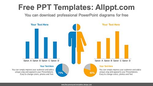
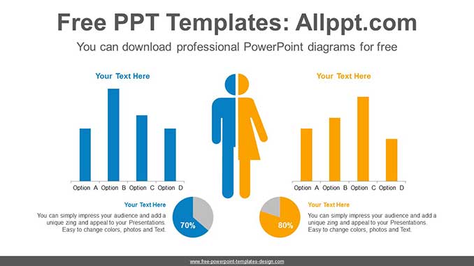
Comparative Mix Chart PowerPoint Diagram
This diagram is a data-based comparative mix chart centering on human icons. A colorful charts has a visual effect. This pie chart can easily adjust numeric values with formula inputs.
Search Keywords: template, presentation, graph, graphic, icons, infographic, information, idea, layout, data, design, process, progress, shape, step, symbol, concept, connection, creative, editable, analysis, analyze, audit, business, chart, element, management, part, report, research, result, statistics, stats, pie, circle, human, comparative, data-based, bar, pie, mix, Male, female
Comparative Mix Chart PowerPoint Diagram
This PowerPoint diagram template has theme color applied. So when you do simple copying and pasting, the color will be applied automatically. In addition, shapes and text are 100% editable
This ‘Comparative Mix Chart PowerPoint Diagram’ Preview:
This template can be used for school classes, business purposes, and commercial purposes. However, this template cannot be distributed absolutely.
You May Also Like